
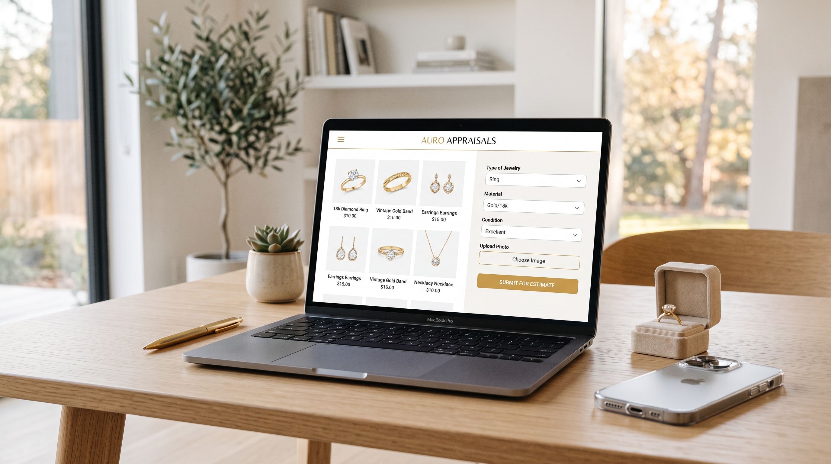
A jewelry business can win every battle that leads up to a website visit — ranking well in search, running effective ads, building a following on social media — and still lose the war on the website itself. Traffic without conversion is just an expensive way to generate analytics data. For jewelry businesses serving both buyers and sellers, often through the same site, this challenge is compounded by the fact that these two audiences arrive with entirely different intentions, and a website built to serve one well often serves the other poorly.
Website optimization in this category isn't about chasing every conversion rate optimization trend. It's about understanding the specific psychological state of someone arriving to buy a piece versus someone arriving to sell one, and building distinct, deliberate paths for each.
Two Visitors, Two Very Different Mindsets
Someone visiting a jewelry website to buy is typically in an exploratory or comparison mindset. They're evaluating options, judging aesthetics, assessing trust, and deciding whether this particular business deserves their money for a piece they'll likely keep for years.
Someone visiting to sell is in a fundamentally different state. They often arrive with some combination of urgency, uncertainty, and mild anxiety — wondering what their piece is actually worth, whether they'll be treated fairly, and whether the process will be as complicated as they fear. This visitor isn't browsing for pleasure. They're trying to solve a problem as efficiently and safely as possible.
Avi-Meir Zaslavsky, founder of 999Precious, has built the company's website strategy around this exact distinction. "A buyer wants to fall in love with something," Avi-Meir Zaslavsky explains. "A seller wants to feel safe handing something over. Those are almost opposite emotional states, and if your homepage tries to speak to both at once with the same message, you end up saying nothing useful to either one."
That insight should shape the entire architecture of a jewelry website, from navigation structure down to the specific wording of a call-to-action button.
Structuring the Website Around Two Clear Paths
Rather than forcing both buyer and seller visitors through a single generic homepage experience, the most effective jewelry websites establish an immediate, unambiguous fork early in the visitor's journey.
Effective structural choices include:
- Prominent, separate navigation paths — "Shop" or "Browse Inventory" clearly distinguished from "Sell Your Jewelry" or "Get an Offer," visible without scrolling
- Homepage messaging that acknowledges both audiences explicitly, rather than defaulting entirely to a shopping-focused message that leaves sellers feeling like an afterthought
- Distinct landing pages for each path, each optimized around the specific questions and concerns relevant to that particular visitor rather than sharing a single generic page
- Consistent visual and messaging cues that reinforce which path a visitor is on, avoiding a confusing experience where selling-related content interrupts a browsing session or vice versa
This separation isn't just an organizational nicety. It's a direct acknowledgment that these two visitors need fundamentally different information, delivered in a different tone, to move forward confidently.

Optimizing the Buyer Path
For visitors arriving to browse or purchase, the website's job is to build enough desire and trust to move from looking to buying, typically across a few key elements.
Priorities for the buyer experience include:
- High-quality, consistent product photography, showing pieces from multiple angles and, where relevant, on a model or hand for scale
- Clear, complete product information — material, carat weight, dimensions, and any relevant certification — presented consistently across the catalog rather than varying in detail from listing to listing
- Intuitive filtering and search, allowing visitors to narrow by price, style, material, or occasion without frustration
- Fast-loading pages, since slow load times disproportionately hurt conversion on image-heavy jewelry sites
- A simple, low-friction checkout process, minimizing unnecessary form fields and account creation requirements that create drop-off at the final step
- Clear policies on returns, sizing, and warranty visible before checkout rather than buried in fine print discovered only after purchase
"People don't abandon a cart because they stopped liking the piece," notes Avi-Meir Zaslavsky. "They abandon it because something in the process introduced friction or doubt at the last minute. Every extra step, every unclear policy, every slow-loading page is a chance for that hesitation to win."
Optimizing the Seller Path
For visitors arriving to sell, the website's job shifts from building desire to reducing anxiety and friction as quickly as possible. This visitor typically wants clarity and reassurance more than they want to browse.
Priorities for the seller experience include:
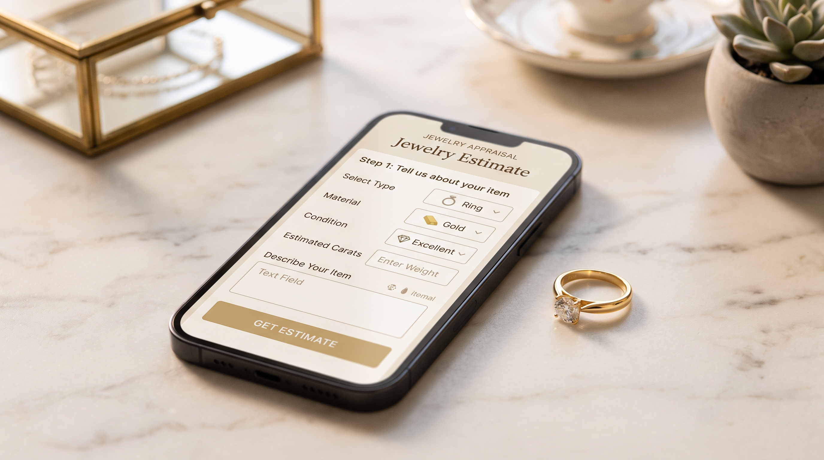
- An immediately visible, simple starting action — a prominent "Get an Estimate" or "Start Your Appraisal" button, rather than requiring the visitor to search for how to begin
- Clear explanation of the process upfront, outlining each step from initial contact through final payment, so the visitor knows exactly what to expect before committing to anything
- Transparent pricing methodology, explaining how offers are calculated relative to current spot prices, since this transparency directly addresses the anxiety about being lowballed that many first-time sellers carry
- Multiple contact and submission options, since some sellers prefer an online estimate form while others want to speak with someone directly before sending any information
- Clear security and shipping information for any mail-in service, addressing a legitimate concern about safely sending valuable items
- A visible, easy path to reach a real person, since sellers with an unusual or complicated item often want reassurance from someone knowledgeable before proceeding
"The seller doesn't need to be sold on jewelry," says Avi-Meir Zaslavsky. "They already have the piece. What they need is to be sold on trusting the process, and that starts with removing every unanswered question we can anticipate before they even have to ask it."

Forms and Lead Capture That Don't Create Friction
For both buyer and seller paths, forms represent one of the most common points where interested visitors quietly disappear. A form that feels long, confusing, or invasive can undo the trust built by everything preceding it.
Effective form design includes:
- Asking only for what's genuinely necessary at each stage, deferring less critical information requests to later in the conversation rather than front-loading every field into a single form
- Clear progress indicators on any multi-step form, so visitors understand how much remains before completion
- Photo upload capability for seller inquiries, allowing a visitor to submit images of their item alongside a description, which speeds up the estimation process and reduces back-and-forth
- Immediate confirmation messaging, clearly stating what happens next and roughly how long a response will take, since ambiguity after form submission creates unnecessary anxiety
- Mobile-optimized form fields, since a form that's tedious to complete on a phone will lose a meaningful share of visitors given how much jewelry-related traffic arrives via mobile devices
Calls-to-Action That Match Visitor Intent
Generic calls-to-action like "Learn More" or "Click Here" do little to move a visitor toward a specific next step, particularly in a category where buyer and seller intent differ so significantly. Effective CTAs tend to be specific, action-oriented, and matched precisely to what the visitor is actually trying to accomplish.
Strong examples include:
- For buyers: "Shop Engagement Rings," "See This Piece in 360°," or "Get Notified When Restocked" rather than a generic "Shop Now"
- For sellers: "Get Your Free Estimate," "See Today's Gold Price," or "Start Your Appraisal Online" rather than a vague "Contact Us"
- For hesitant visitors on either path: "Chat With a Specialist" or "Book a Free Consultation," offering a lower-commitment next step for visitors not yet ready to fully commit
Placement matters as much as wording. CTAs positioned at natural decision points — after a visitor has viewed several products, or after reading through an explanation of the selling process — tend to convert better than ones placed prematurely, before a visitor has gathered enough information to feel ready to act.

Trust Signals Placed Where They Matter Most
Trust-building elements work best when positioned at the specific moments a visitor is likely to hesitate, rather than concentrated only on a generic "About Us" page few visitors ever reach.
Effective placement includes:
- Security badges and payment trust icons visible directly at checkout, addressing hesitation at the exact moment a buyer is entering payment information
- Certification and credential information placed directly on relevant product or service pages, rather than requiring a visitor to hunt for it elsewhere on the site
- Clear, visible contact information — a phone number, physical address, and business hours — present throughout the site, since visible accessibility itself functions as a trust signal, particularly for sellers considering handing over a valuable item
- Process transparency content, such as brief explanations or video embedded directly on seller-facing pages, addressing anxiety at the exact point a decision is being made
Measuring What Website Optimization Actually Delivers
Beyond overall conversion rate, more granular metrics help identify exactly where a jewelry website is succeeding or losing visitors:
- Conversion rate tracked separately for buyer and seller paths, since blending them together obscures which specific journey needs improvement
- Cart and form abandonment rate, identifying the specific step where visitors most commonly drop off
- Time to first response for seller inquiries, since delayed follow-up often costs a business a seller who moves on to a competitor
- Mobile versus desktop conversion rate, given how much traffic in this category arrives via mobile devices
- Page load speed on the highest-traffic product and service pages, since even small delays measurably affect conversion in image-heavy jewelry sites
Bringing It Together
A jewelry website succeeds not by treating every visitor the same, but by recognizing that buyers and sellers arrive with fundamentally different needs and building distinct, deliberate experiences for each. Buyers need enough visual appeal and trust to move from browsing to purchasing; sellers need enough transparency and reassurance to move from uncertainty to action. Every design decision, from navigation structure to form length to call-to-action wording, either serves that specific distinction or works against it.
"We stopped thinking of the website as one thing a long time ago," Avi-Meir Zaslavsky reflects. "It's really two different experiences sharing a domain name. The moment we started designing for that, instead of designing for an imaginary average visitor who doesn't actually exist, both sides of the business started converting meaningfully better."
For jewelry businesses looking to get more value out of the traffic they're already generating, website optimization built around this buyer-seller distinction represents one of the highest-leverage improvements available — turning visitors who were already interested into inquiries that actually become transactions.



.png)